
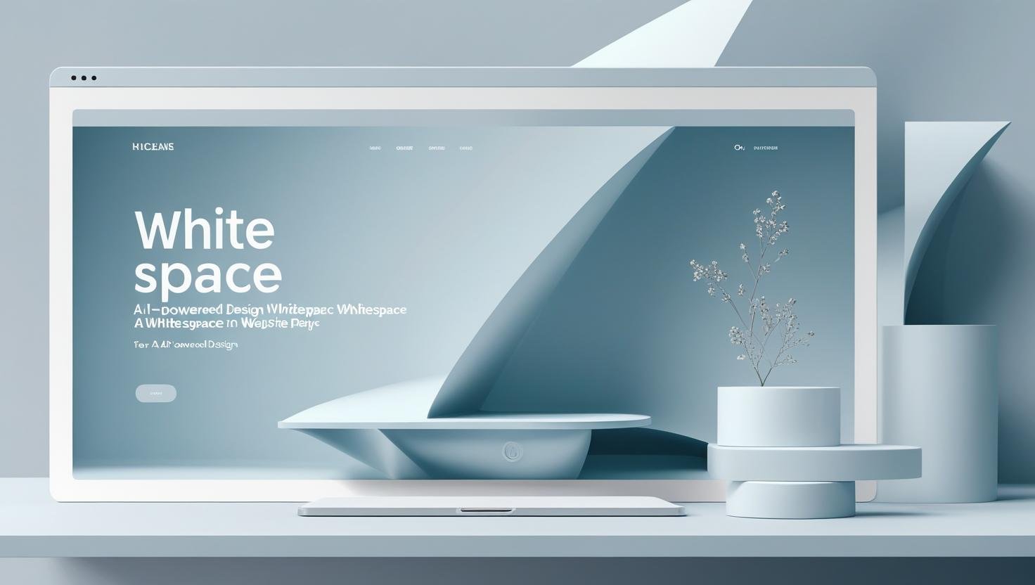
White Space The Undervalued Hero
White space can transform your website and might be the most undervalued element in web design. Also called negative space, it’s not just empty areas on your webpage – it’s a powerful tool that can dramatically improve how users experience your website. Yet I constantly see businesses cramming every inch of their site with content, thinking more information equals more value.
Here’s the Truth
White space isn’t wasted space. It’s working space that guides attention, improves readability, and ultimately drives more conversions. Let me show you how strategic use of white space can transform your chaotic website into a conversion machine.
In the crowded digital marketplace, your website has one job: guide the visitor to take action. Whether it’s clicking a button, reading a blog post, or making a purchase, design plays a pivotal role in that journey. But one design principle is often misunderstood – or worse, ignored entirely.
It’s not a flashy animation or an expensive plugin. It’s white space. Also known as negative space, white space refers to the empty areas between design elements: margins, padding, line spacing, and even the space between text and images. It’s not “wasted space”—it’s a strategic tool.
Used well, white space can reduce visual noise, increase comprehension, and improve user experience. In short, white space can turn chaos into clicks.
Why Our Brains Crave White Space
Human brains are pattern-recognition machines, constantly trying to organise and make sense of visual information. When a webpage is cluttered with text, images, buttons, and graphics all competing for attention, our brains have to work overtime to process everything.
This cognitive overload leads to what designers call “banner blindness” – when there’s too much visual noise, users start ignoring everything. They can’t distinguish between what’s important and what’s decoration, so they often just leave instead of trying to figure it out.
White space acts like a reset button for the brain. It provides visual breathing room that allows users to process information in digestible chunks. When you give important elements space to breathe, they naturally draw more attention and feel more significant.
Apple is a classic example of white space in action. Their website designs are clean, elegant, and intentionally minimal. Every element has room to breathe, and every product feature is showcased without clutter. It’s no coincidence that this approach contributes to high engagement and brand trust.
The Psychology of Perceived Value
Here’s something fascinating: White space actually makes your content appear more valuable and premium. Think about luxury brands – Apple, high-end fashion websites, expensive restaurants. They all use generous amounts of white space because it creates an impression of quality and exclusivity.
When your website feels spacious and uncluttered, visitors subconsciously associate this with professionalism and attention to detail. Conversely, cramped layouts signal budget constraints or lack of sophistication, even if that’s not true.
This perception directly impacts purchasing decisions. Users are more likely to trust and buy from websites that feel premium and well-designed, and white space is one of the easiest ways to achieve this elevated feeling.
Strategic White Space Placement
Not all white space is created equal. Random gaps don’t improve your design – strategic placement does.
Here’s where white space creates the biggest impact:
Around your headlines: Give your headlines room to command attention. A headline surrounded by text gets lost, but one with generous white space above and below it becomes a natural focal point that draws the eye.
Between sections: Clear separation between different content areas helps users understand your information hierarchy. When everything runs together, it creates visual confusion and makes scanning difficult.
Around call-to-action buttons: Your most important buttons should have plenty of breathing room. White space around CTAs makes them appear more clickable and important. A button buried in text feels less significant than one standing alone.
In your margins: Resist the urge to stretch content to fill every pixel. Generous margins create a comfortable reading experience and prevent your site from feeling cramped on larger screens.
The Mobile White Space Challenge
White space becomes even more critical on mobile devices where screen real estate is limited. The temptation is to cram more content into smaller spaces, but this creates an overwhelming experience on tiny screens.
Instead, be more selective about what content appears on mobile. Use white space to create clear separation between tappable elements – fingers need more space than mouse cursors. Elements that are too close together lead to accidental taps and user frustration.
Consider how white space affects mobile scrolling too. Strategic use of space can create natural pause points that encourage users to stop and engage with important content instead of mindlessly scrolling past everything.
White Space and Conversion Optimisation
Here’s where white space directly impacts your bottom line: it can dramatically improve conversion rates. When your most important elements – like contact forms, pricing information, or purchase buttons – have adequate white space around them, they perform better.
I’ve seen simple changes like adding white space around a contact form increase completion rates by over 20%. When forms feel less cluttered and overwhelming, people are more likely to fill them out.
The same principle applies to product pages, service descriptions, and any content where you want users to take action. White space creates focus, and focus drives conversions.
White Space Isn’t Just “Blank”
Let’s clear up a common misconception: white space doesn’t have to be white. It just means space free of content or decoration. This could be a solid colour, a background image, or even subtle gradients—anything that allows the eye to rest and focus.
Too many businesses cram every available pixel with content, mistakenly believing that more information equals more value. But cognitive science says otherwise. The human brain can only process a limited amount of information at a time. A cluttered design overwhelms users, pushing them away instead of drawing them in.
Hierachy and Focus
White space naturally creates a visual hierarchy. It guides users through the page, signalling what to read first, what to ignore, and what action to take next. Call-to-action buttons, in particular, benefit from generous breathing room. A button surrounded by white space will always outperform one buried in a sea of text or competing elements.
Improves Mobile Experience
With mobile users now accounting for over half of all web traffic, designing for small screens is essential. White space makes mobile navigation easier and more intuitive. On touchscreens, clickable areas need room around them to prevent user frustration. Overcrowded mobile layouts lead to accidental clicks and missed content—both of which hurt conversion rates.
White Space Is an Investment, Not a Luxury
Clients sometimes worry that too much white space makes the site look “empty.” But the opposite is true. White space elevates your content, adds sophistication to your design, and shows confidence in your message. Instead of trying to shout over the competition, it lets your site whisper with clarity—and that can be far more persuasive.
Common White Space Mistakes
The biggest mistake is treating white space as leftover area that needs to be filled. Every space on your website should be intentional, not accidental. Another common error is inconsistent spacing – using different amounts of white space randomly throughout your site creates a disjointed, unprofessional appearance.
Don’t confuse white space with boring design either. You can have colourful, engaging websites that still use white space effectively. The key is being intentional about what gets space and what doesn’t.
Your White Space Action Plan
Start by identifying your most important content – the elements that drive business results. Give these priority content generous white space to help them stand out. Then work backwards, reducing space around less critical elements.
Test the impact by comparing user behaviour before and after white space improvements. Look at metrics like time on page, scroll depth, and conversion rates. You’ll likely see improvements across the board.
Remember, white space isn’t about having less content – it’s about presenting your content more effectively. When you give your important messages room to breathe, they become impossible to ignore.
Final Thought
White space is one of the most powerful – and underutilised – tools in web design. When used strategically, it enhances user experience, increases engagement, and guides visitors toward action. So if your website feels chaotic or cluttered, the solution may not be to add something. It might be to remove something
Less really can be more – especially when it comes to white space.